Account designer
Use the Account designer to set site preferences and default settings for the Grant Request Login page, My Account pages, and new forms.
To access the Account designer, navigate to Applications, Forms manager, then select Settings, Account Designer.
Tip: Maximize your browser window when working with the Account designer.
 Navigation and Layout
The Account designer is divided into three panels.
-
Left Panel: Displays various configuration options depending on the current Setting menu selection.
-
Center Panel: Serves as a WYSIWYG preview for the Login, Account, and Forms tabs.
-
Right Panel: Collapsed by default. It displays additional property settings when specific Links or Messages are selected on the left panel. If not in use, the panel is hidden by clicking the Show/Hide arrow in the lower right.
From the Settings menu, you can choose which options to display in the left panel. Then select the Login, Account, or Form tab to preview those features based on the current design settings. To update the design, select Settings, Design.
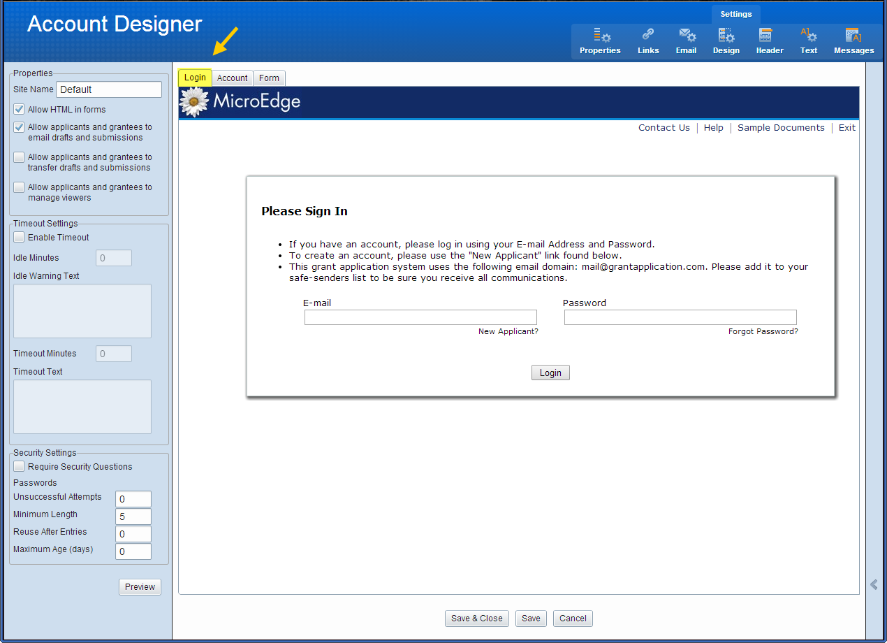
Login Tab
Displays what the Login page looks like to applicants.
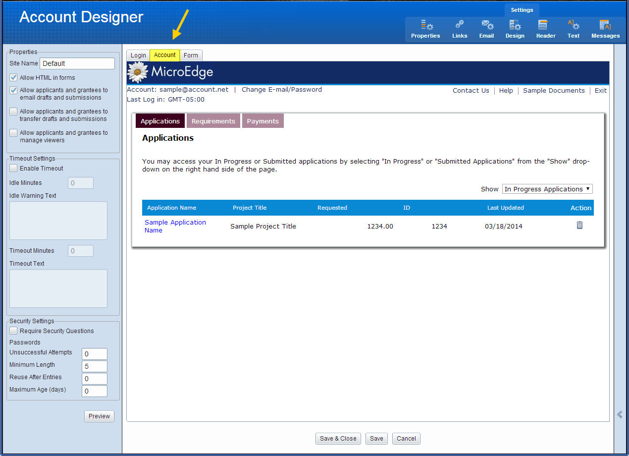
Account Tab
Displays what the My Account pages looks like to applicants.
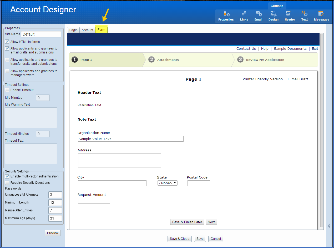
Form Tab
Displays the default settings and design for new forms.
Note: You can update the default settings for each form in the Forms designer.
 Properties
Select Properties to customize the general site, session timeout, and security settings.
 Properties
-
Site Name: Overrides the default site name.
-
Allow HTML in forms: Enables HTML code to be used in online forms. If this option is selected, HTML text displays as active links on forms. If the option is cleared, any HTML text on a form displays as regular text.
Note: If this option is turned on after forms have already been created, the new preference is not applied to existing forms until they are opened and saved again
-
Allow applicants and grantees to email drafts and submissions: Required to enable Application and Requirement collaboration.
-
Allow applicants and grantees to transfer drafts and submissions: Required to enable Application and Requirement collaboration.
-
Allow applicants and grantees to transfer drafts and submissions: Required to enable Application and Requirement collaboration.
-
Enable Simplify: Enables applicants to quickly complete applications with data from their Guidestar profile.
 Timeout Settings
-
Enable Timeout: Enables the Timeout Settings features.
-
Idle Minutes: The amount of time that must elapse without the applicant posting data to the server before the Idle Warning Text is displayed.
-
Idle Warning Text: The text displayed to the applicant along with the option to Continue or Exit.
-
Timeout Minutes: The amount of time that must elapse without the applicant posting data to the server or clicking Continue on the Idle Warning prompt before the system logs out of the account and displays the Timeout Text.
-
Timeout Text: The text displayed to the applicant after the session has been terminated.
-
Security Settings: All passwords in Grantmaking are case sensitive and a more stringent password policy is enforced when applicants create passwords (either on first login, or after a password reset).
-
Require Security Questions: Upon account creation, applicants are required to select six questions and provide answers so that they may unlock their account if it becomes locked due to unsuccessful attempts. If checked, applicants are required to answer three of the six questions that validate the account holder identity prior to sending a temporary password when a password is forgotten (which unlocks the account).
 How Timeout Settings Work:
The Idle Minutes is required to be less than the Timeout Minutes. Default times respectively are 15 and 20 minutes. These fields cannot be set to zero.
Example: Idle Time = 15 minutes, Timeout Time = 20 minutes
This allows the applicant 5 minutes to see the Idle Warning and take action before the session is terminated.
When the Idle Minutes time is reached, a prompt is displayed containing the Idle Warning Text and the option to Continue or Exit.
-
If Continue is selected, the timeout counter is reset to zero and begin counting up again.
-
If Exit is selected, the session is disconnected and the applicant is taken to the login screen.
-
If no action is taken by the applicant, the system continues to count up until it reaches the Timeout Minutes set and then display the Timeout Warning. Clicking OK takes the applicant to the account login page.
Typing inside fields on the application does not reset the idle timer. In order to reset the idle timer, an action must be taken that saves data to the server.
Actions that cause current data to be saved to the server include:
-
Select a different page of the application using Next/Continue links, Page Number or Page Title links/tabs, or Chevron Progress Bar links.
-
Clicking Save & Finish Later.
-
Uploading Attachments.
 Security Settings
-
Enable multi-factor authentication: When this option is selected, forms will require multi-factor authentication (MFA) during sign in. MFA provides an additional level of security to the Grantee Portal log in.
When enabled, MFA adds the following steps to the log in for all grantees:
-
The user enters their organization-specific user name/email and password for the Grantee Portal.
-
The Grantee Portal sends a verification code to the user's email.
-
The Grantee Portal prompts the user to enter the verification code they received. The user must enter this code within five minutes to log in to the Grantee Portal.
New users will be prompted to configure MFA when they create their account; existing users will be prompted to configure MFA the first time they log in after Enable multi-factor authentication is selected.
Users can save their device verification for up to 30 days.
The following settings, found under the Email tab, are relevant to MFA emails:
Display name: The label that will appear in the "From" name in the email containing verification codes.
"Reply to" email address: Sets the email address that will be shown to the user when they receive their verification code.
Note: Instruct users to add this email address to their permit list if the verification codes go to their junk folders.
For frequently asked questions on MFA, see Multi-factor authentication (MFA) FAQ.
Read more about Blackbaud's cybersecurity initiatives at Blackbaud Security.
-
-
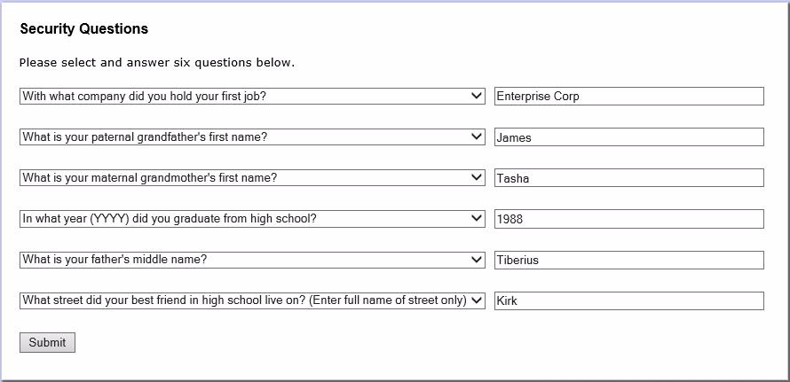
Require Security Questions: Prompts users to answer a set of security questions at their next log in.
When an applicant logs in for the first time after the security settings have been changed, the following occurs:
-
The applicant is brought to the Change Password page and must enter a new password. The new password requirements are applied.
-
If no security question responses have been previously provided, the applicant is brought to the Security Questions page. There are six sets of questions and answers that must be set up by the applicant when creating their account. In the case of a forgotten password, the applicant needs to answer three of these questions to get their password reset. Once provided, the applicant is directed to the page that required login.
-
-
Passwords
-
Unsuccessful Attempts: The number of password attempts available to an account holder until the account is locked out
-
Minimum Length: The minimum password length. This number must be at least 12
-
Reuse After Entries: The number of times many times the password must be changed before it a previous password can be reused
-
Maximum Age (days): The number of days before a password expires
Note: These password options must meet or exceed the minimum password requirements outlined in Authentication and Security Changes (2022). Values that do not match these minimum requirements will be overruled by the application requirements.
-
-
Account Lockout
This enhancement tracks the number of unsuccessful attempts and prevents access to the account after the specified number of unsuccessful attempts.
Once locked, the account may only be unlocked by resetting the password or if the applicant answers three or more security questions correctly.
-
If an applicant answers three or more of the security questions, the applicant is sent a temporary password.
-
If the applicant cannot answer the security questions correctly, the applicant must contact the Grants Manager to reset the password for the applicant's account email using the Reset Grantee Password option on the Online Applications menu.
-
 Links
Links
Select Links to customize the links and buttons available on the Online Applications pages.
To view the available settings for a link or button, select it in the left panel.
Note: The order of the first four links (Contact Us, Help, Sample Documents, and Exit) are reordered by dragging and dropping.
The example below shows the settings for the Exit link on the right panel.
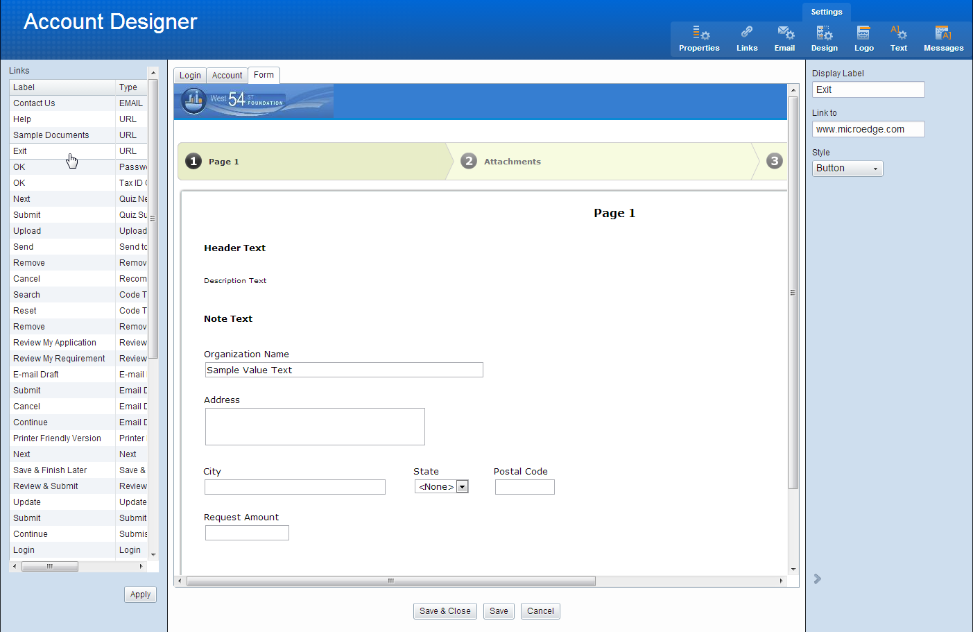
The settings available for each link vary depending on the one selected.
-
Display Label: The text displayed on the site page or form.
-
Style: If available, enables selecting between a Link or Button display.
-
Link to: For links that require a URL or Email address.
-
Position: Select the position for the link. Left, Right, or Standard.
-
Duplicate to Top: Places the link in the header area. This changes the default behavior of only displaying some links in the footer area.
 Email
Email
Select email to customize online application email messages.
The left panel displays a list of all the email types. Select an email type to view its settings and default subject/body text.
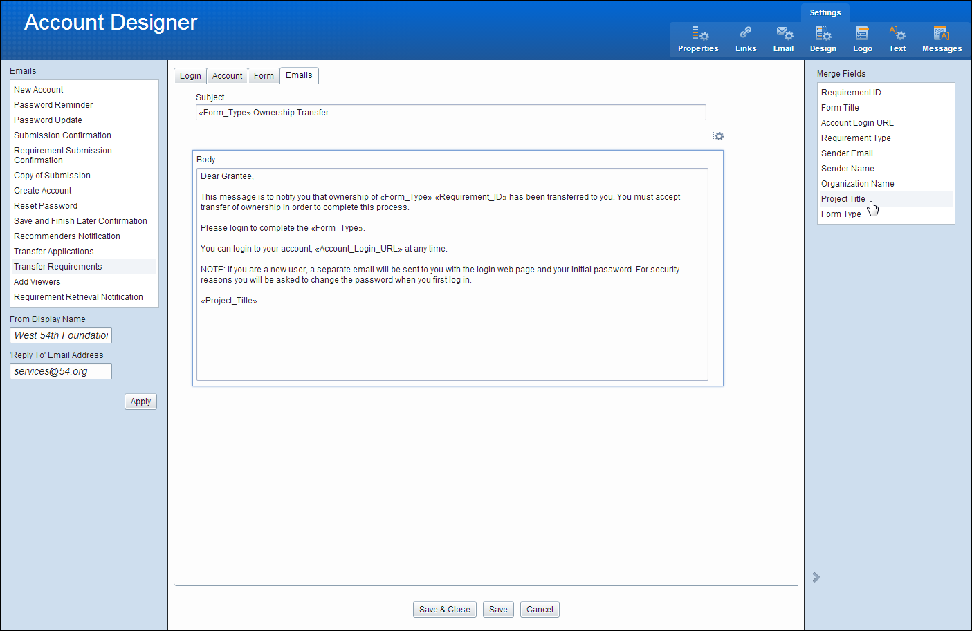
The From Display Name and ‘Reply To’ Email Address is set here for each one of the emails.
Clicking in the Subject or Body fields of any email displays available merge fields on the right side panel.
To add a merge field, place the cursor in the location you want the merge field to appear and then double-click it on the right panel list.
 Requirement Retrieval Notification
This email notification is sent to the staff owner when a Requirement they are assigned to is retrieved.
The option is enabled by selecting the Requirement Retrieval Notification email type and unchecking the Do not send notification check-box.
By default this option is checked, meaning no email notification is sent.
 Header
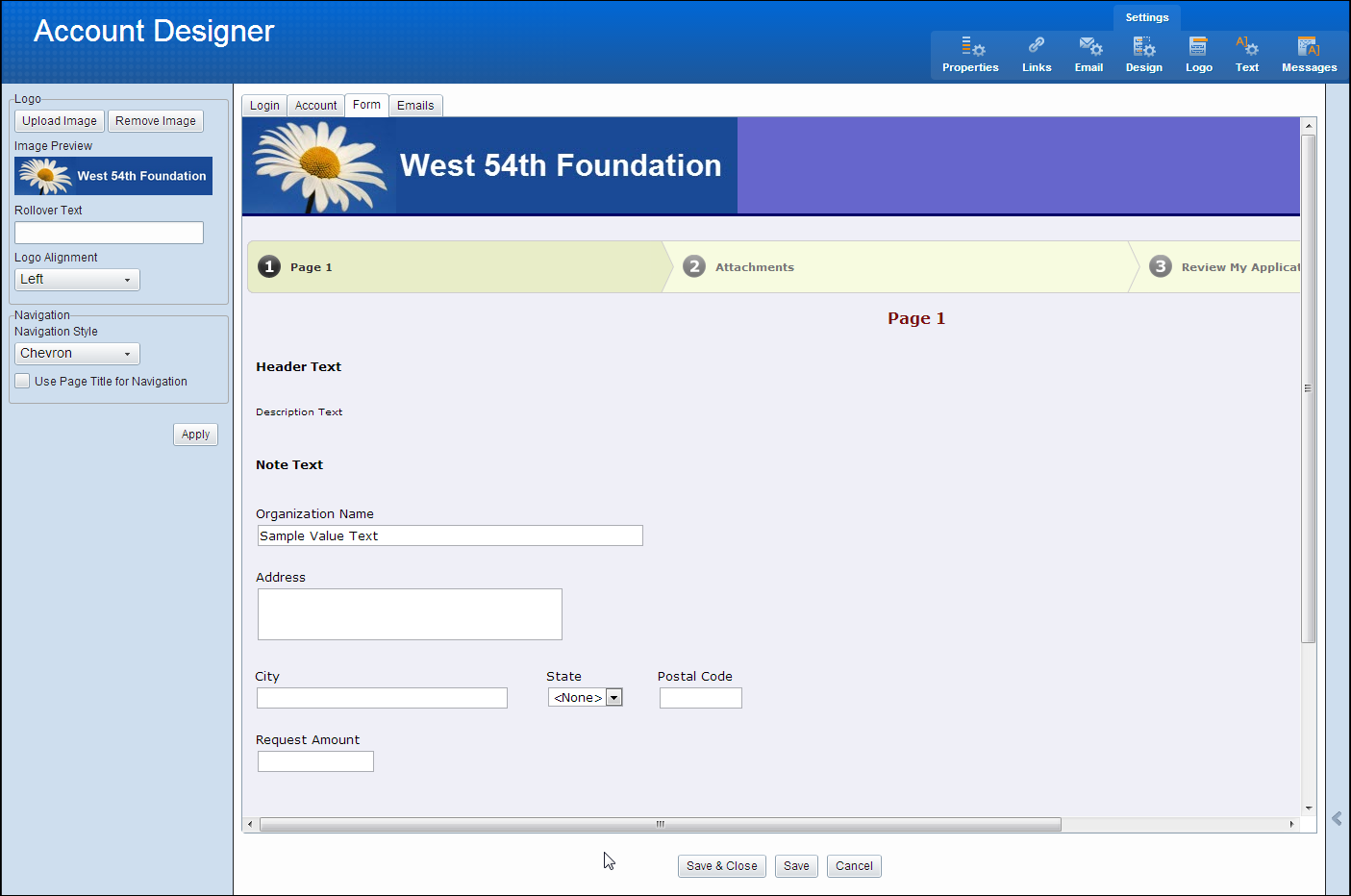
Select Header to customize the logo and navigation settings.
Logo
-
Upload Image: Click to browse for an image to upload as a logo.
-
Remove Image: Click to remove the current logo image.
-
Image Preview: Displays the current logo image.
-
Rollover Text: Enter text here to be displayed when a user place their mouse over the logo.
-
Logo Alignment: Select the alignment for the logo in the header area.
Navigation
-
Navigation Style: Select from Classic number tabs or Chevron style (shown above).
-
Use Page Title for Navigation: Displays page titles at the top instead of page numbers on application/requirement forms.
 Design
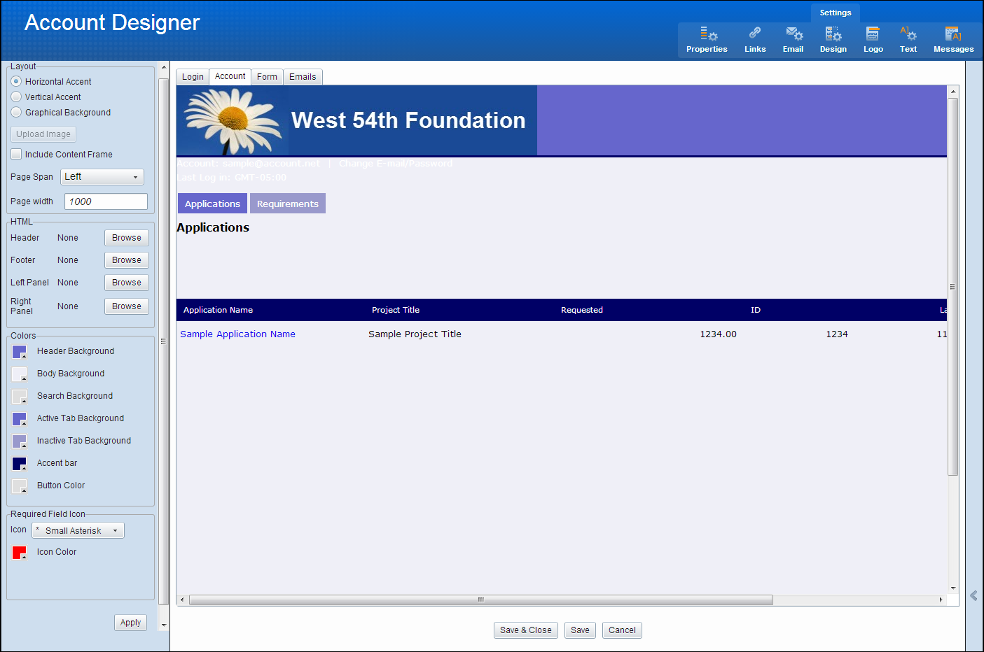
The Design tab of the Design Wizard edits the layout, colors, and text properties of your My Accounts and Application pages.
These settings become the default settings for forms created in the Forms manager.
This menu option displays the settings responsible for much of the layout aspects of the site pages and forms.
 Layout
-
Horizontal Accent: This default layout option consists of a colored header, a differently colored body area, and a menu bar separating the two.
-
Vertical Accent: Creates an application/online requirement with a solid background color and an accent bar along the left-hand side.
-
Graphical Background: Retains the menu bar, but the header and body areas are populated by a graphic of your choosing. In the center of the body area is a white area where your application/online requirement form prompts appear. Uploading graphic files is discussed in the Graphics section.
-
Include Content Frame: Creates a frame around your entire form page.
-
Page Span: Controls how your pages make use of onscreen space.
Entire-page forms take up all the space available in the current window.
Left, fixed width- forms align to the left of the screen and be limited to the Page Width setting.
Center, fixed-width forms center on the current window and be limited to the Page Width setting.
-
Page width: Only available if Page Span is set to Left or Center. The minimum setting is 1000 pixels. Entries less han 1000 defaults back to 1000 pixels.
-
HTML: Review the Custom HTML section for more details.
-
Header: Click Browse to add your own custom HTML to the area indicated.
-
Footer: Click Browse to add your own custom HTML to the area indicated.
-
Left Panel: Click Browse to add your own custom HTML to the area indicated.
-
Right Panel: Click Browse to add your own custom HTML to the area indicated.
 HTML
HTML
To provide top quality performance and security, Blackbaud Grantmaking will be disabling the option to use HTML files to add custom header, footer, and side panels in your application forms, My Account, and Account Login pages as of January 31st, 2024.
No changes are needed if you want to continue using your existing files. After this date, you will no longer be able to upload, edit, or remove HTML Header, Footer, Left Panel, or Right Panel files.
 Colors
-
Header Background
-
Body Background
-
Search Background
-
Active Tab Background
-
Inactive Tab Background
-
Accent Bar
-
Button Color
-
Required Field Icon
-
Icon: Select an icon to display next to all required fields on your application/online requirement using the drop-down menu.
-
Icon Color: You may choose the color of the icon.
-
Apply
 Select colors
In this section, you can override the system default settings for the colors on the application/online requirement.
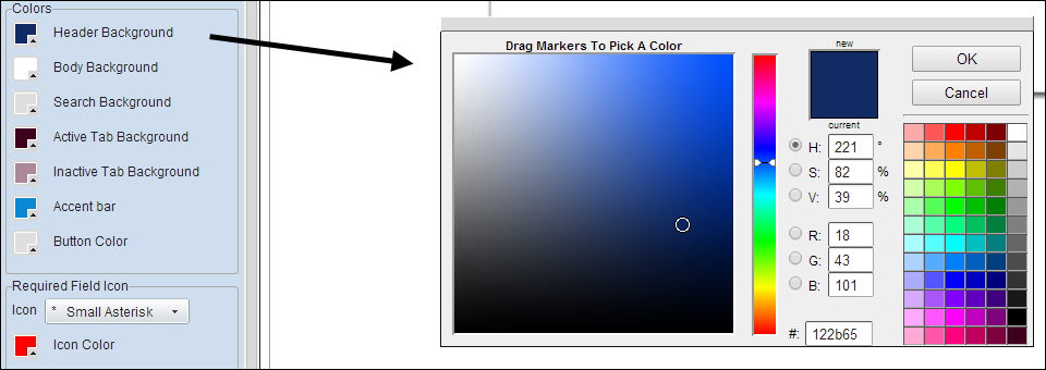
To select a new color:
-
Select one of the preset colors in the palette to the right.
-
Enter the desired color's hex value in the # field at the bottom.
-
Adjust the HSV and RGB values manually.
-
Move the color slide up or down, or drag the small white circle around the left side color field.
Some considerations regarding colors:
-
The column header color on the My Account page is controlled by the Accent Bar color.
-
If you have selected the Graphical Background layout option, the Header Background and Body Background fields are disabled since the entire background (header and body) consists of an imported graphic.
-
If you have chosen the Vertical Accent layout option, the Header Background color is unavailable because the layout does not include a header.
 Text
Text
Select Text to select the font formatting options for your application and online requirements. You can change the Font, Size (relative or fixed), Alignment, Bold, Italic, and Color.
Note: Changes made to the Form Title are displayed in the Printer Friendly Version of the form.
If you would like to make the selected element bold or italicized, select the appropriate check-box.
The last setting selects the color of the font for the selected element in the same way you selected the colors of the application parts.
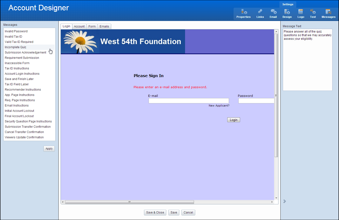
 Messages
Select Messages to view the list of system messages that may appear to a grantee/applicant during the application process when an error occurs or the user needs more information. You can use the default text provided or update it.
